Despite being best known for their massive, Walmart-esque superstores, the Midwest's massive merchandise Mecca has experimented with smaller formats a couple of times over the years.
The early 2010s brought Meijer Marketplace, a ~100,000 sq ft grocery-focused concept tested at a handful of Chicagoland locations. Despite their smaller size and narrowed focus, these had a similar big-box environment to a typical Meijer, and a small general merchandise selection. The experiment didn't last; most of the locations closed (a rarity for Meijer) before the decade was out, and only one, in Orland Park, Ill., remains in operation today.
Meijer's definitely had better fortunes with their individually-named "markets," a considerably smaller grocery store format designed-and-built for urban areas. They've opened four across Michigan since 2018, and seem eager to continue expansion, as a fifth is currently under construction in Cleveland (plus that oddball "Fresh Thyme" in St. Louis). With them, they did an impressive job adapting to a ~40,000 sq ft space, proving that they can, in fact, successfully operate smaller stores. (The Detroit-area and Lansing locations will be covered in future posts.)
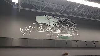
For their third modern foray into smaller grocery stores, Meijer Grocery, the company targeted a size in between the prior two. As the name implies, it's similar in format to a typical grocery store, spanning roughly 75,000 square feet, dedicated mostly to food and pharmaceuticals. The concept was revealed in September 2022, with two exurban Metro Detroit sites announced for the inaugural stores: 24 Mile and Hayes in Macomb Township, and Lapeer and Clarkston Roads in Orion Township just south of Lake Orion. Both were new construction, with the Orion store rising on the site of a demolished Kmart.
Both opened as scheduled on January 26, 2023.
The glass atrium on the corner reminds me vaguely of LiDL's early stores in the States. In it, employees were handing out reusable bags as opening-day giveaways, flanked by flowers and a cart corral to the left, and produce and the customer service desk to the right. Sandy lurked in the corner.
The color scheme continues around the corner, where meat coolers flank a massive selection of wine. A few faux wood accents and old photographs adorn the wall, sprucing up the black-and-white environment.
Shop-and-scan is heavily emphasized throughout; the carts (which are black, not the usual Meijer blue) feature cellphone holders, adorned with the Meijer logo.
All told, the new store's modern design was stunning, and it seems to make for a pleasant shopping experience. I hope we'll see more of Meijer Grocery in the near future - I suspect the concept was created in part for expansion into new markets; perhaps the chain's oft-speculated eventual entry into Minneapolis would begin with these.
Next weekend will see a doubleheader, with two posts covering the recent closures of Oakland County Bed, Bath & Beyond stores.


